The PolarGridbrand, in one place.
Logos, colour, and type for anyone writing or designing for PolarGrid. Download the assets and follow these rules so the brand looks the same everywhere it shows up.
Logo mark
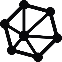
The outer ring is thicker than the lines inside it. That contrast keeps the mark readable at small sizes like the favicon and nav bar.


Horizontal lockup
Use the lockup wherever there's room for the wordmark. Pick the version that matches the background it sits on.




Favicon
 PolarGrid | The complete infrastructure
The mark on a Near Black tile, readable at 16px.
Download
Download the app icon to use for avatars, social profiles, and app tiles.

Colour
PolarGrid Pink is #E11C79. It passes accessibility contrast checks at logo and heading sizes on both Near Black and white.
Primary. Logo, headings, key actions.
Background. The default canvas.
Text on dark, and light backgrounds.
4.4:1
Pink on Near Black · WCAG AA large text
4.5:1
Pink on White · WCAG AA large text
Use Pink for large text (24px and up, or 18.66px bold) and graphics. For body copy, use white on Near Black or Near Black on white.
Instrument Sans
Instrument Sans is our typeface for the wordmark, headings, and body copy. JetBrains Mono is for code, labels, and technical details.
Aa
ABCDEFGHIJKLMNOPQRSTUVWXYZ
abcdefghijklmnopqrstuvwxyz 0123456789
- Ag
Regular
400
- Ag
Medium
500
- Ag
Semibold
600
- Ag
Bold
700
Display
60 / 1.04 · Semibold
Inference at the edge
Heading
36 / 1.2 · Semibold
Run models near your users
Body
18 / 1.6 · Regular
PolarGrid runs managed inference on a network of GPU sites close to your users.
Eyebrow
12 · Mono · Uppercase
Managed inference
Usage
A few rules that keep the brand consistent.
Do
- Use the supplied SVG files exactly as provided.
- Leave clear space around the logo equal to the height of the mark's outer node.
- Use the pink logo on Near Black, and the light-background lockup on white.
- Use the mono versions when the logo sits on photography or colour.
- Write the name as one word with a capital G: PolarGrid.
Don't
- Don't recolour, stretch, rotate, or add effects to the logo.
- Don't use the old pink (#D31A71). Use #E11C79.
- Don't put the pink logo on busy or low-contrast backgrounds.
- Don't use the mark below 16px or the lockup below 120px wide.
- Don't write it as Polar Grid, Polargrid, or POLARGRID in running text.
Need something not covered here? Email hello@polargrid.ai.